
Choose a workspace
3 design workspaces
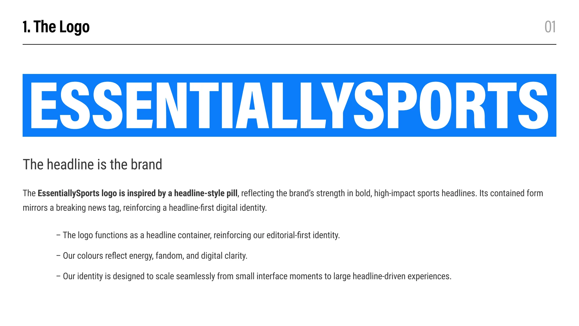
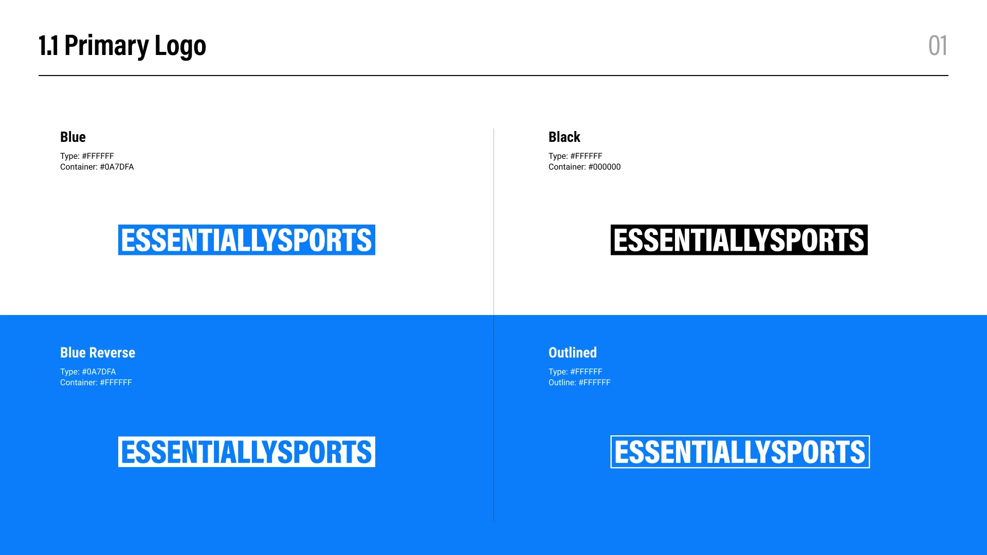
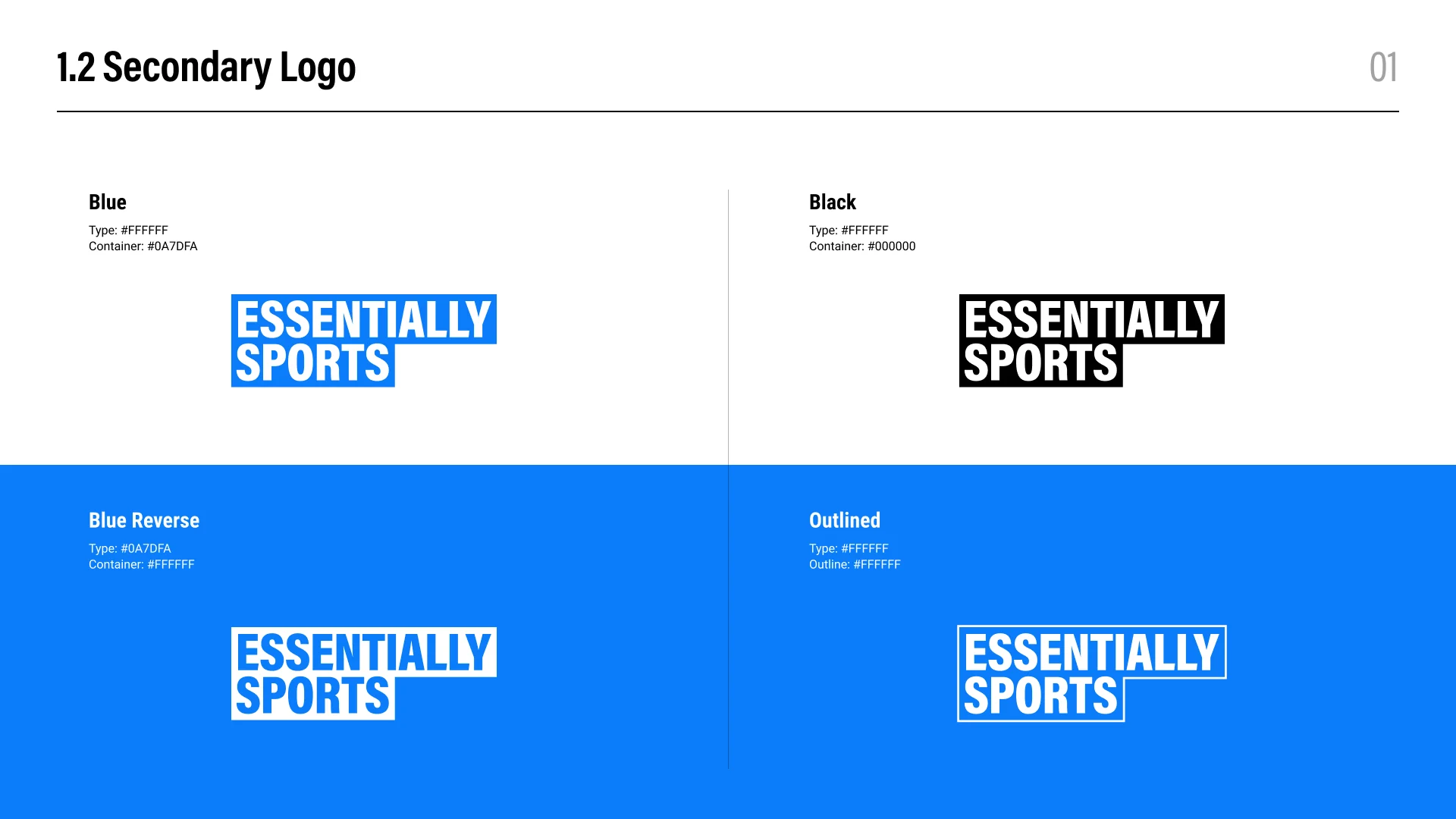
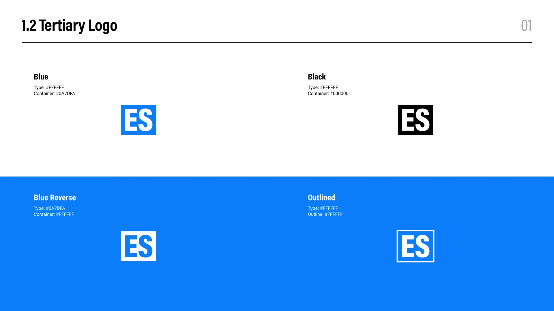
Use the primary wordmark on larger editorial and brand surfaces, the stacked secondary mark where horizontal space is limited, and the ES tertiary mark for compact interface placements.
Use only the approved blue, black, blue reverse, and white outlined treatments shown above. Select the version that creates clear contrast with its background.
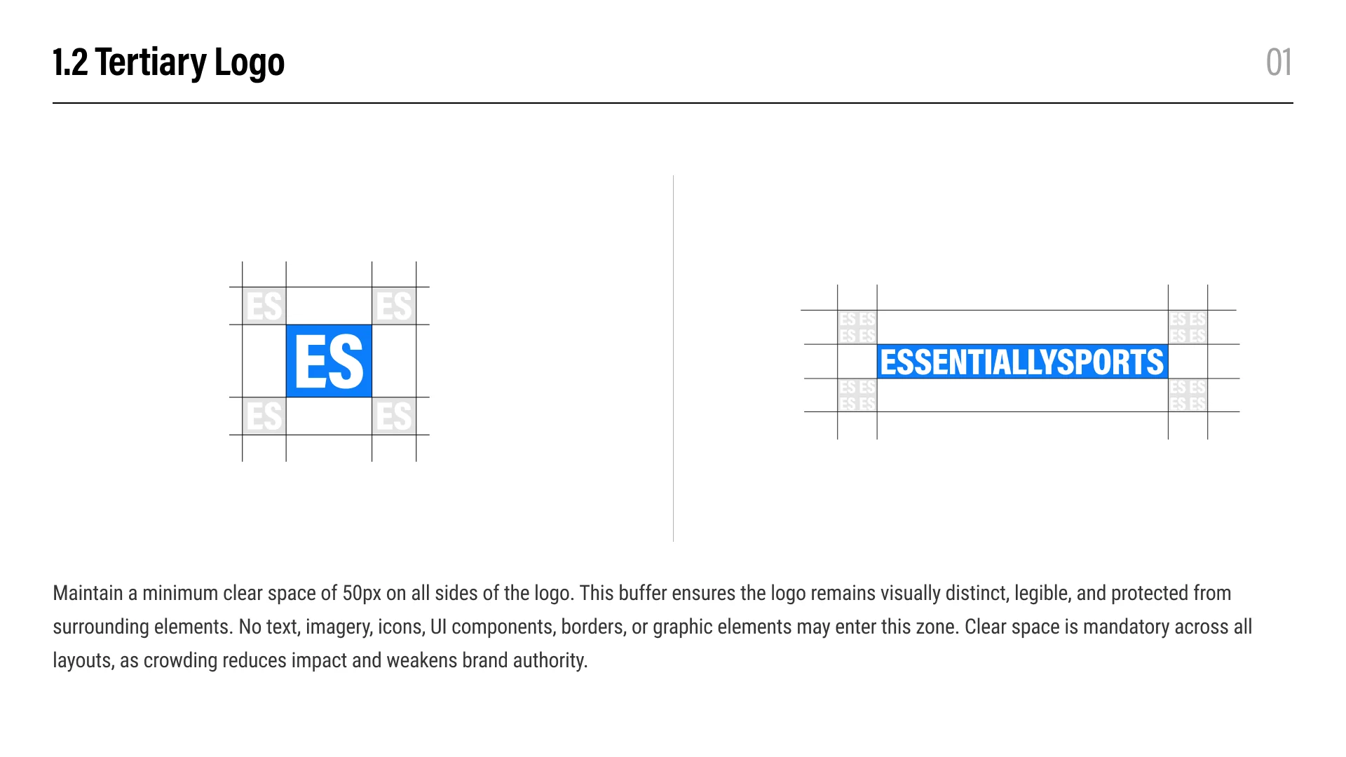
Maintain at least 50px of unobstructed space on every side. Text, imagery, borders, icons, and other interface elements must remain outside this area.
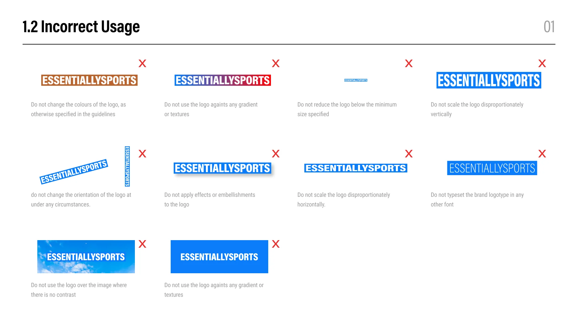
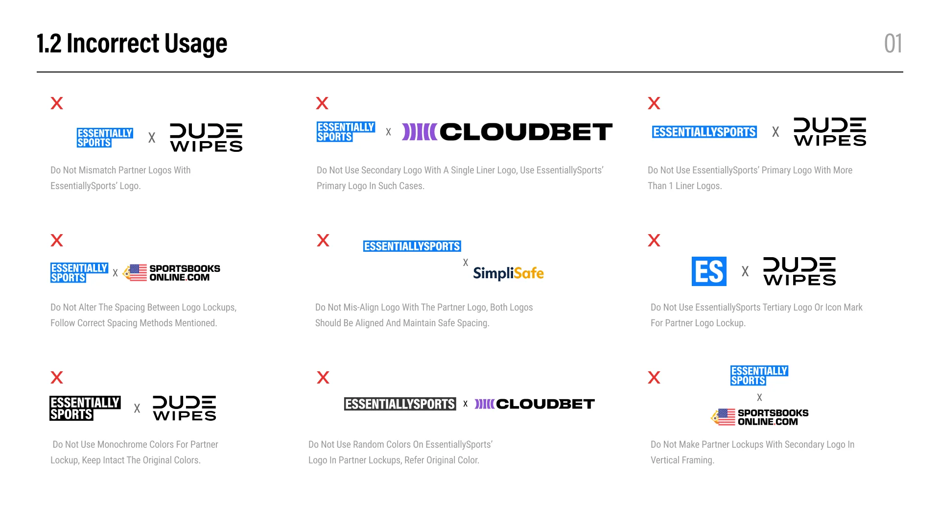
No. Do not stretch, compress, rotate, recolor, crop, typeset, outline, or add shadows, gradients, textures, and other effects. Keep the original proportions and construction intact.
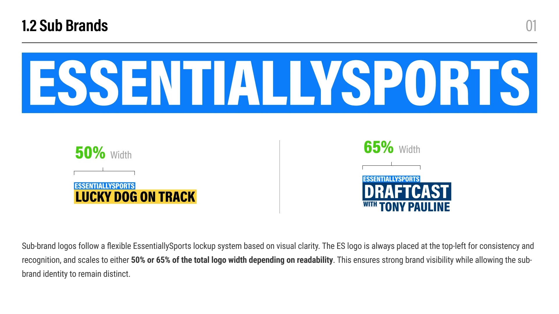
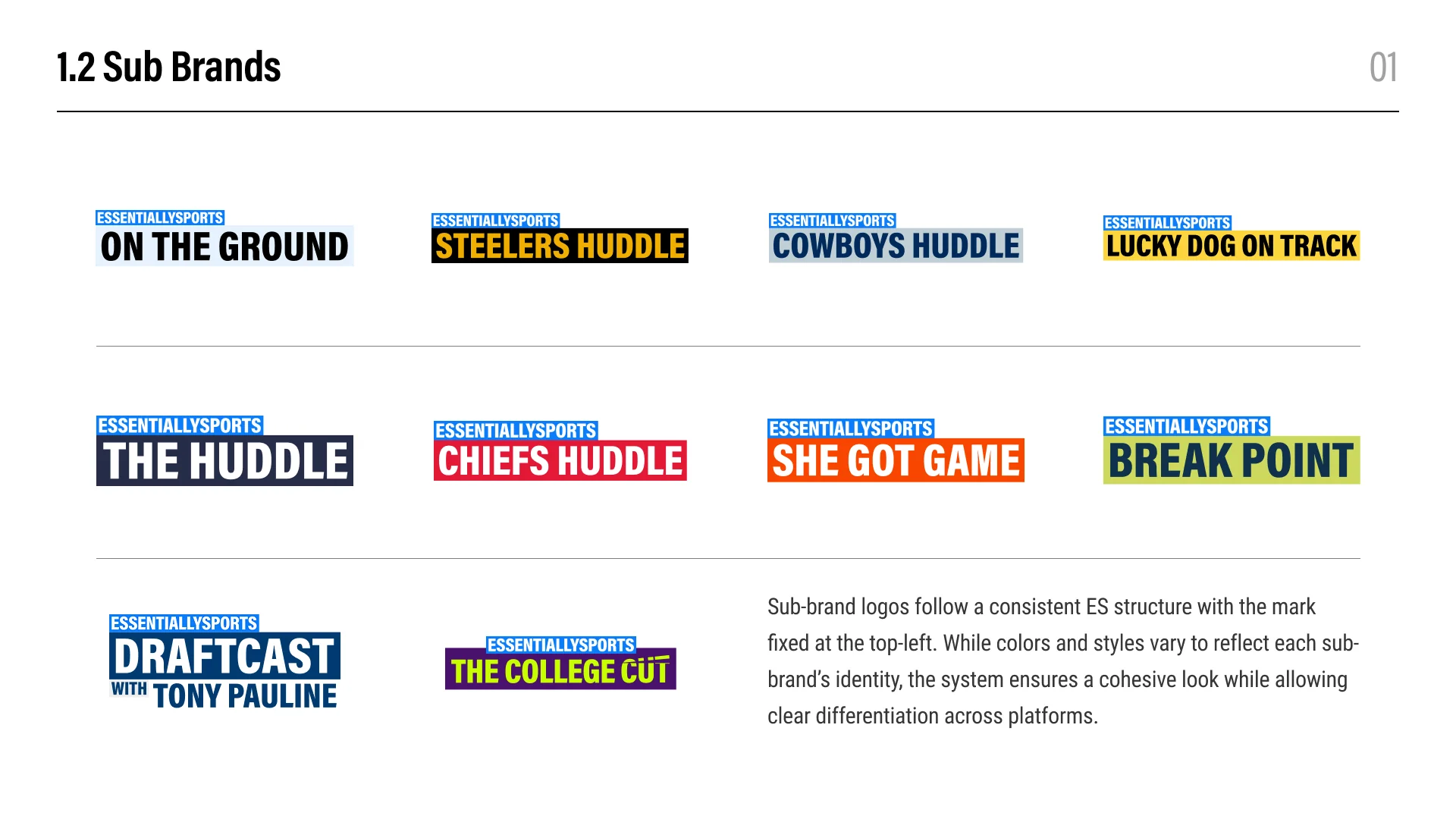
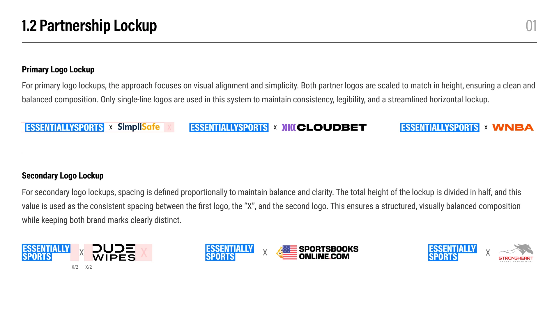
Keep the EssentiallySports mark fixed at the top-left of the approved lockup. Depending on readability, it should occupy either 50% or 65% of the total logo width.
Match the visual height of single-line logos in primary lockups. For secondary lockups, use the approved stacked logo and proportional spacing so both marks remain balanced and distinct.
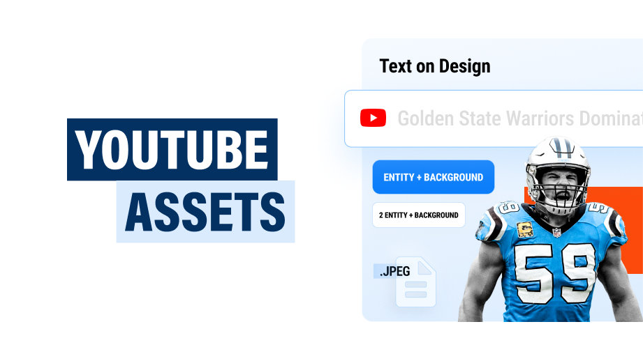
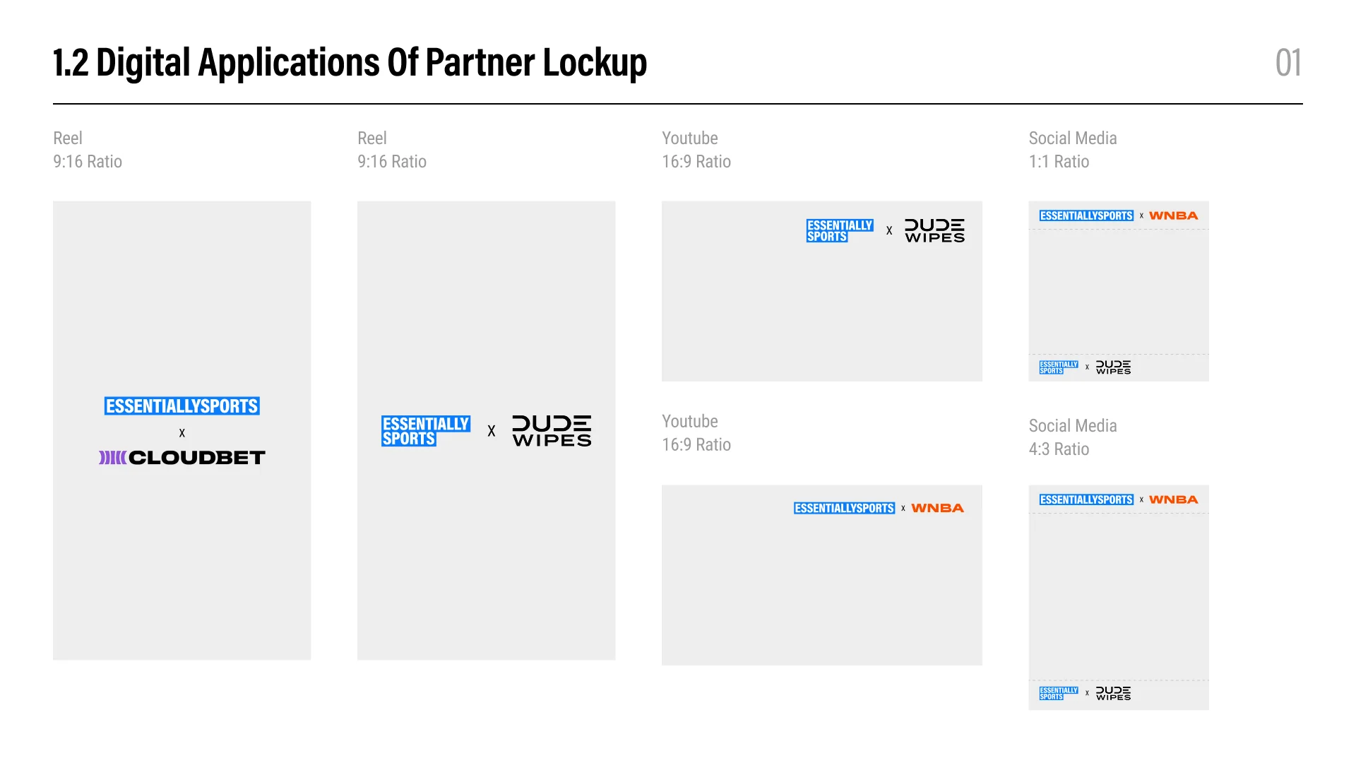
Use the approved compositions for reels, YouTube thumbnails, and social formats. Preserve alignment, spacing, original brand colors, and the specified horizontal or vertical arrangement for each format.
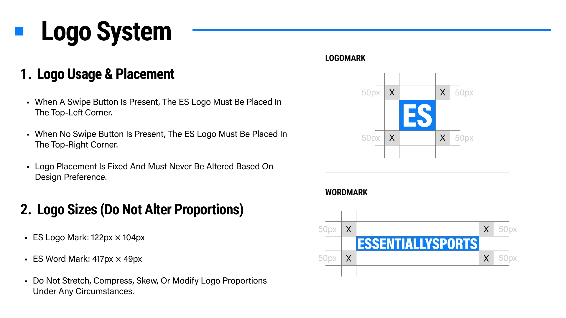
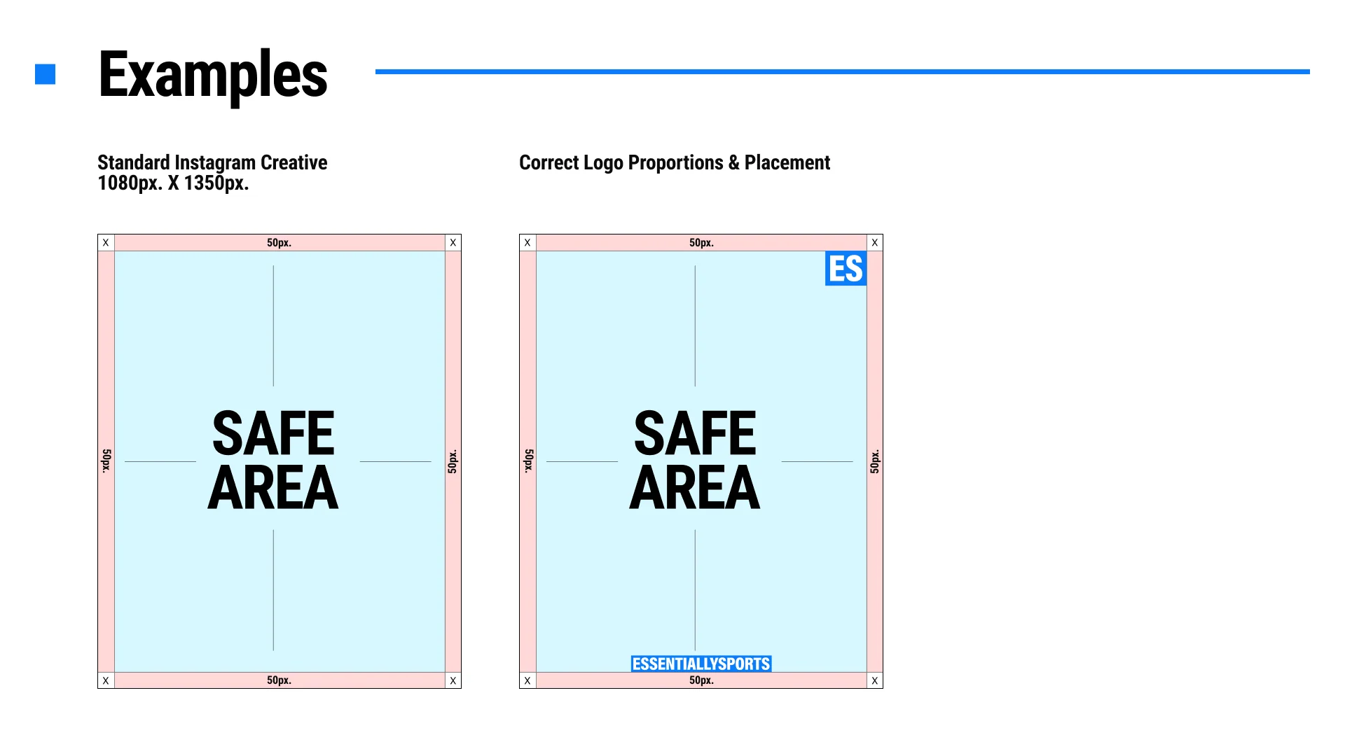
Place it in the top-left when a swipe button is present and in the top-right when there is no swipe button. Placement is fixed and should not change for design preference.
Use the ES logomark at 122px by 104px and the wordmark at 417px by 49px. Preserve the original proportions and maintain the specified 50px clear space.
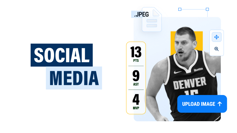
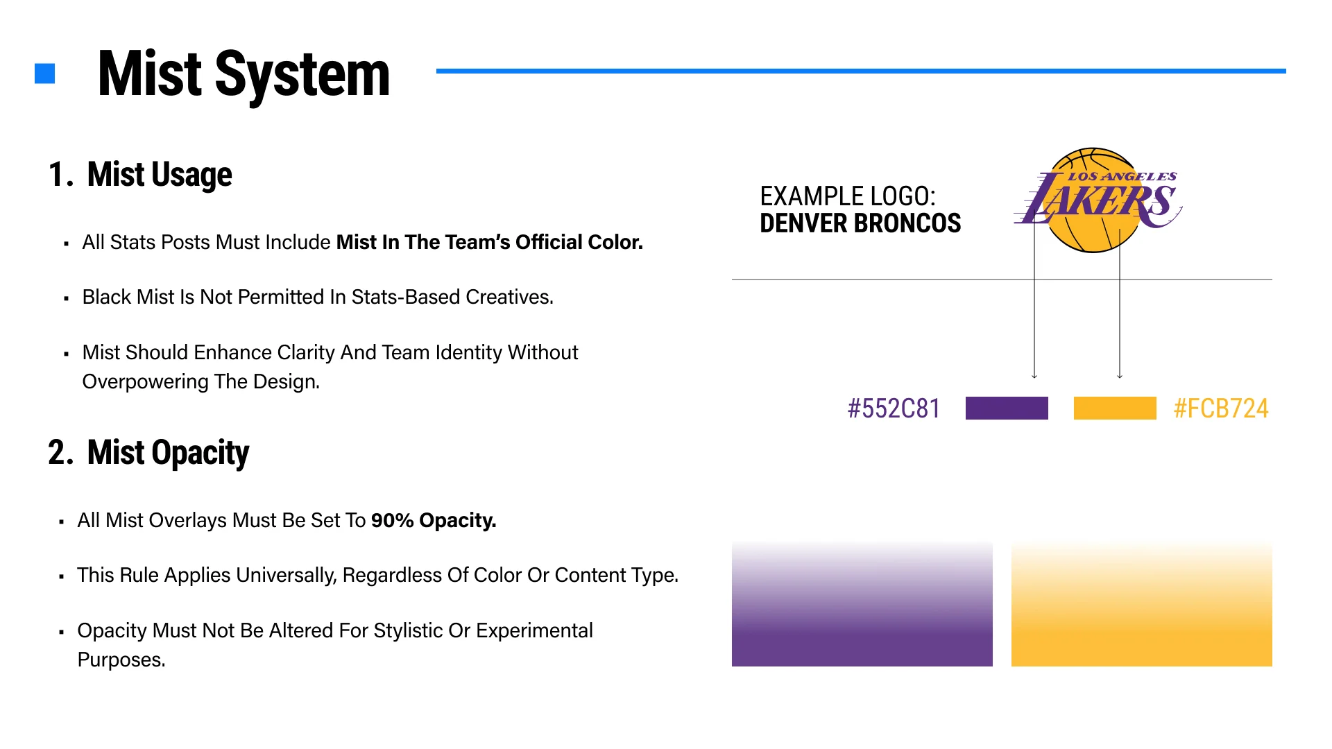
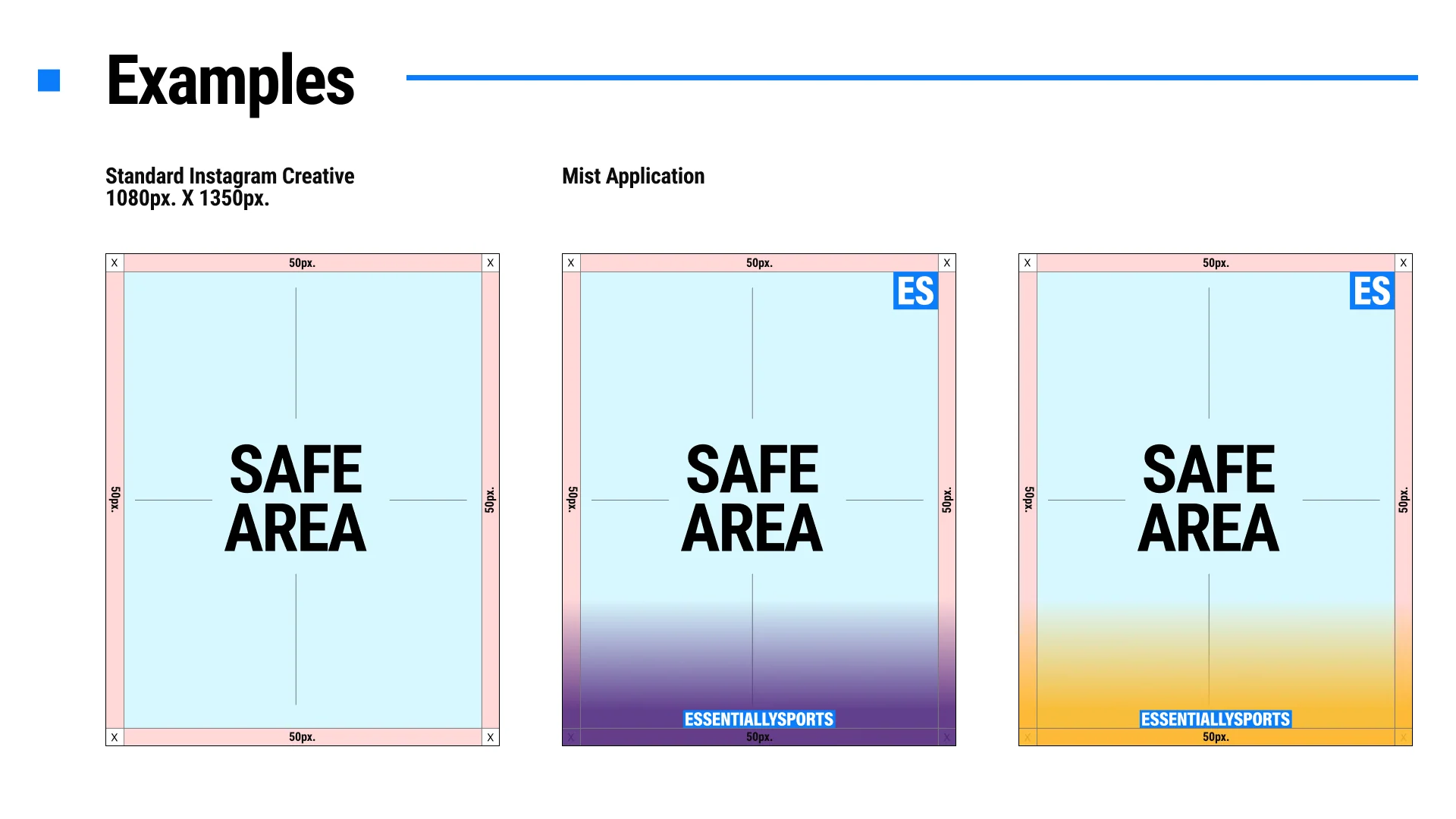
Stats posts must use mist in the team’s official color at 90% opacity. Black mist is not permitted for stats-based creatives, and the fade should support clarity without overpowering the design.
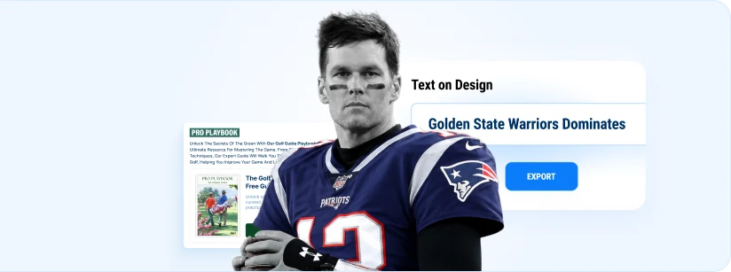
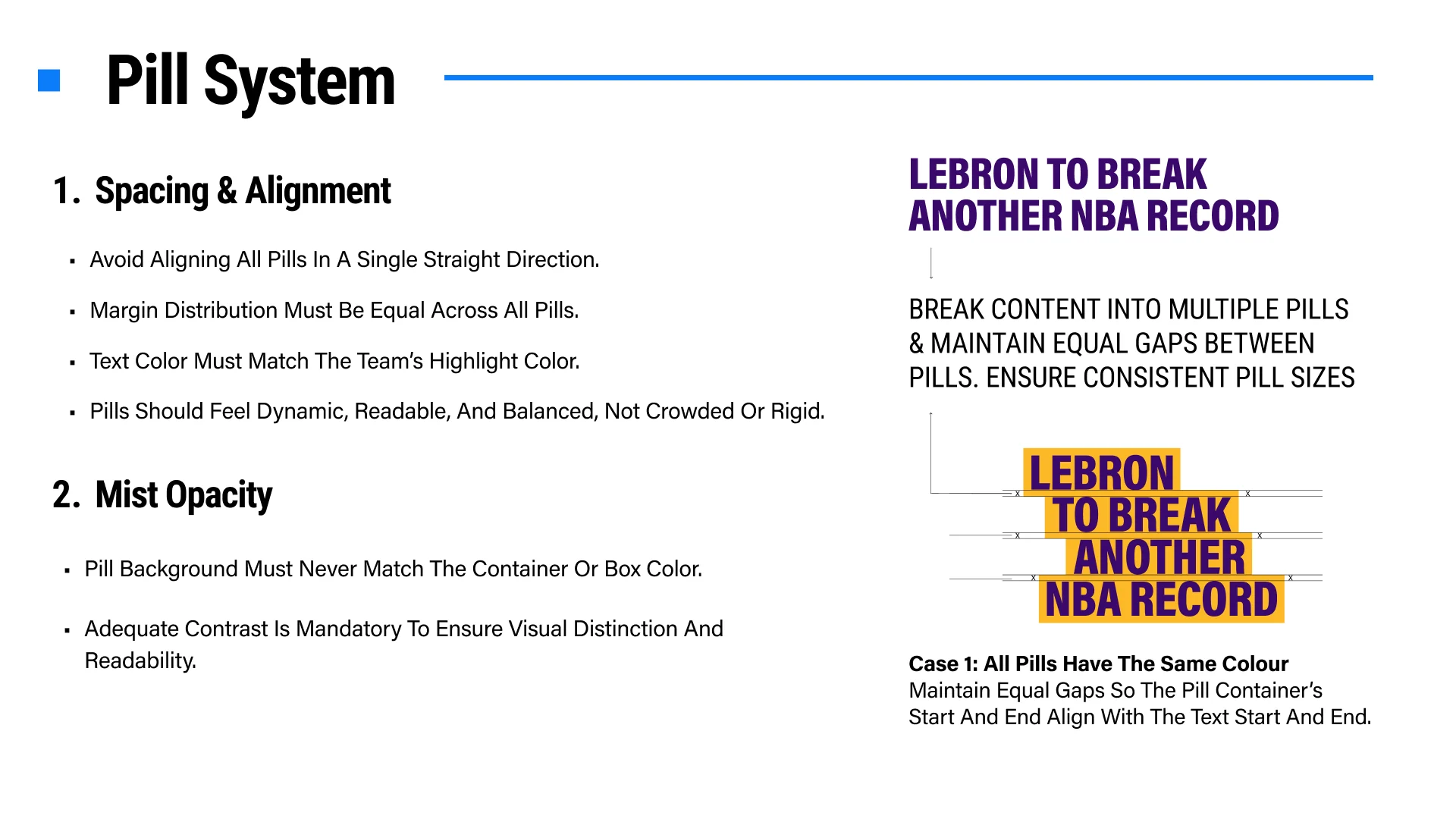
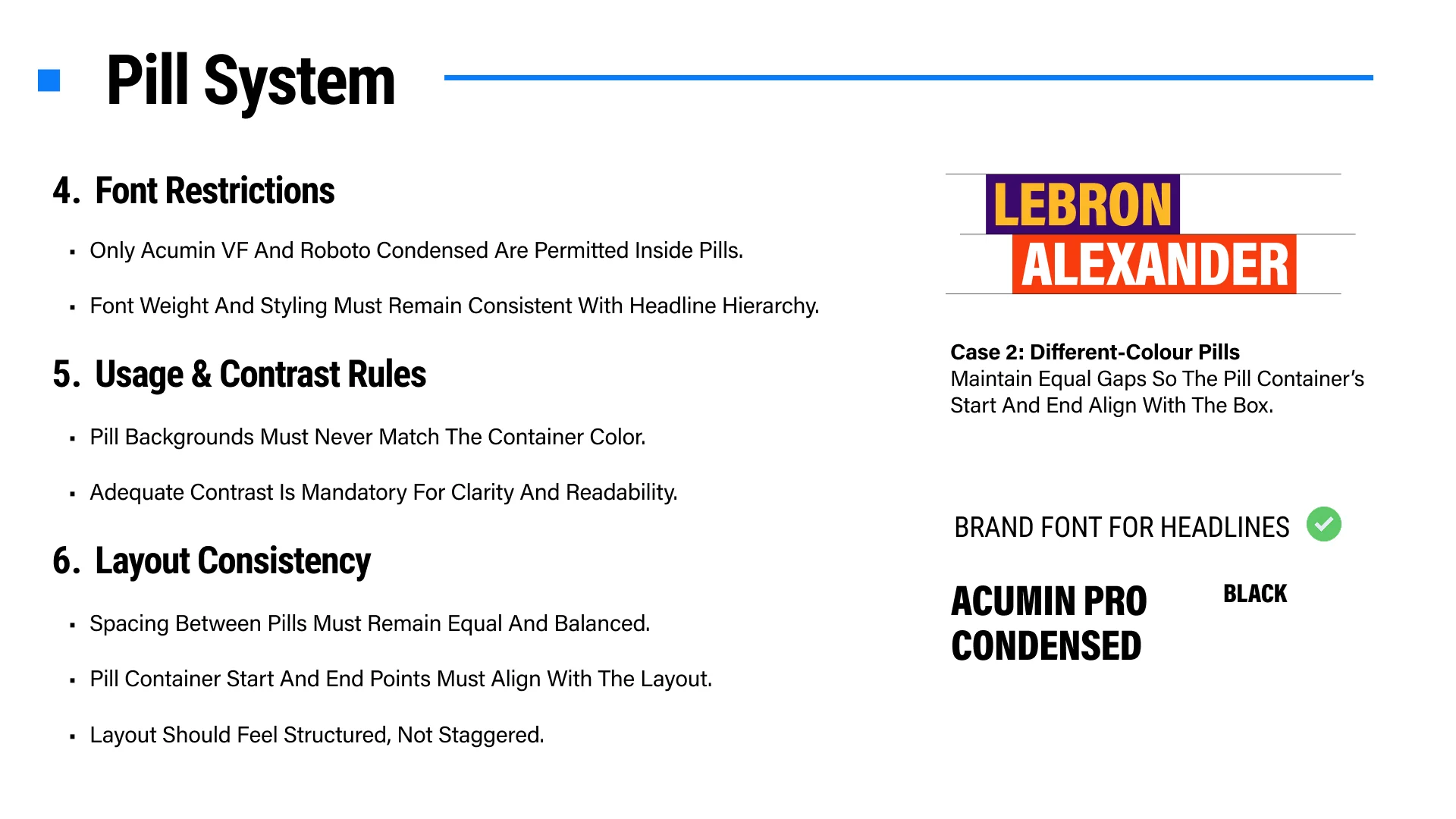
Break headlines into readable pills with equal spacing and balanced margins. Avoid rigid single-direction alignment, maintain strong contrast, and align the pill container with the beginning and end of the text.
Use only Acumin VF or Roboto Condensed, with weight and styling consistent with the approved headline hierarchy.
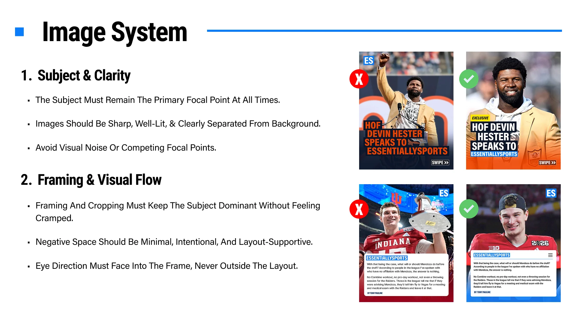
Choose a sharp, well-lit image with one clear focal subject. Keep cropping intentional, reduce visual noise, preserve useful negative space, and direct the subject’s gaze into the composition.
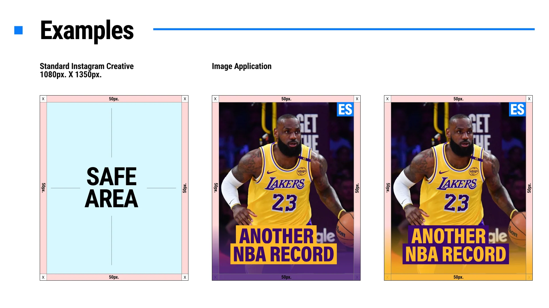
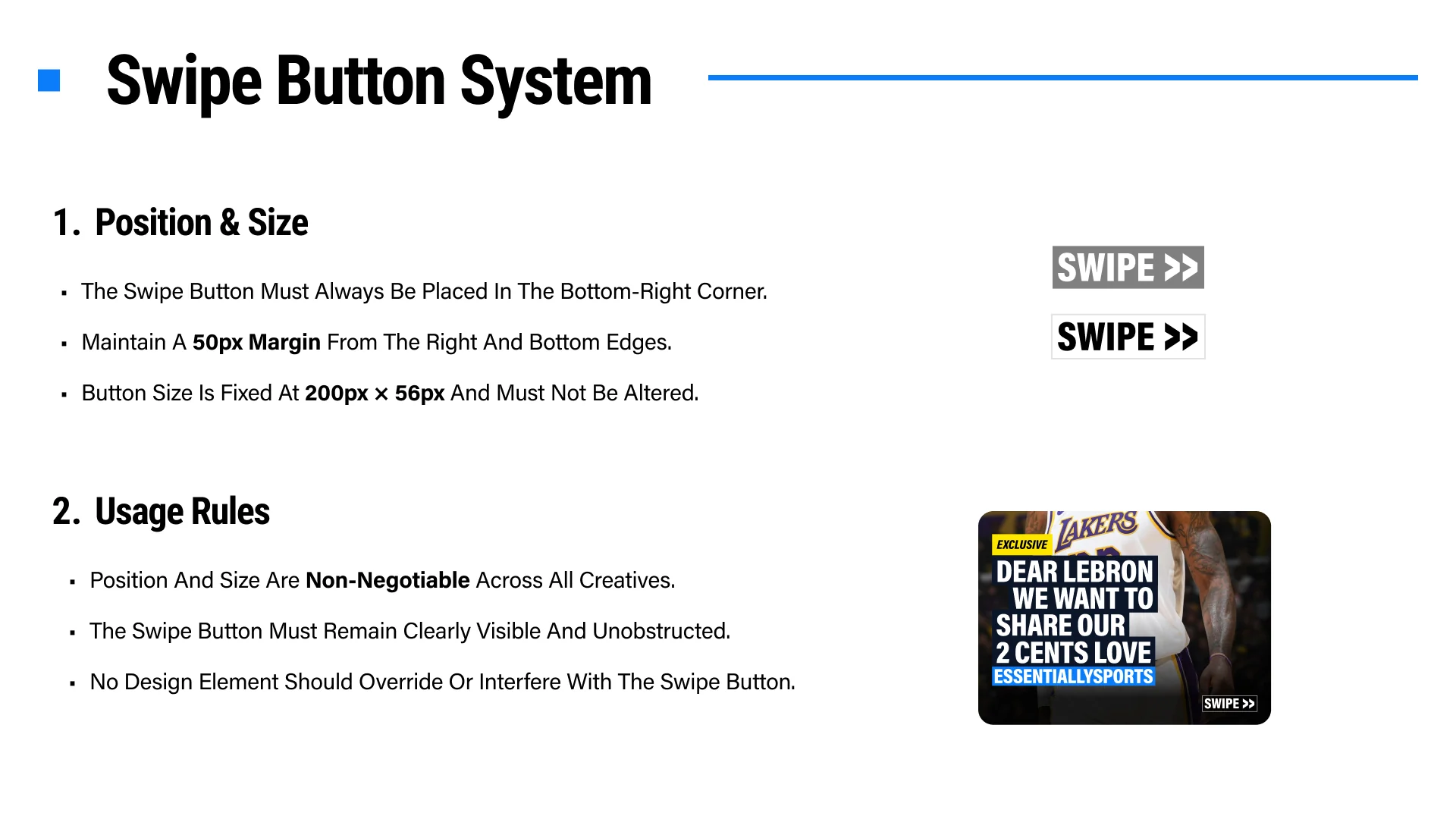
Keep it fixed in the bottom-right corner with a 50px margin from the right and bottom edges. Its size is 200px by 56px, and no other element may obscure or override it.
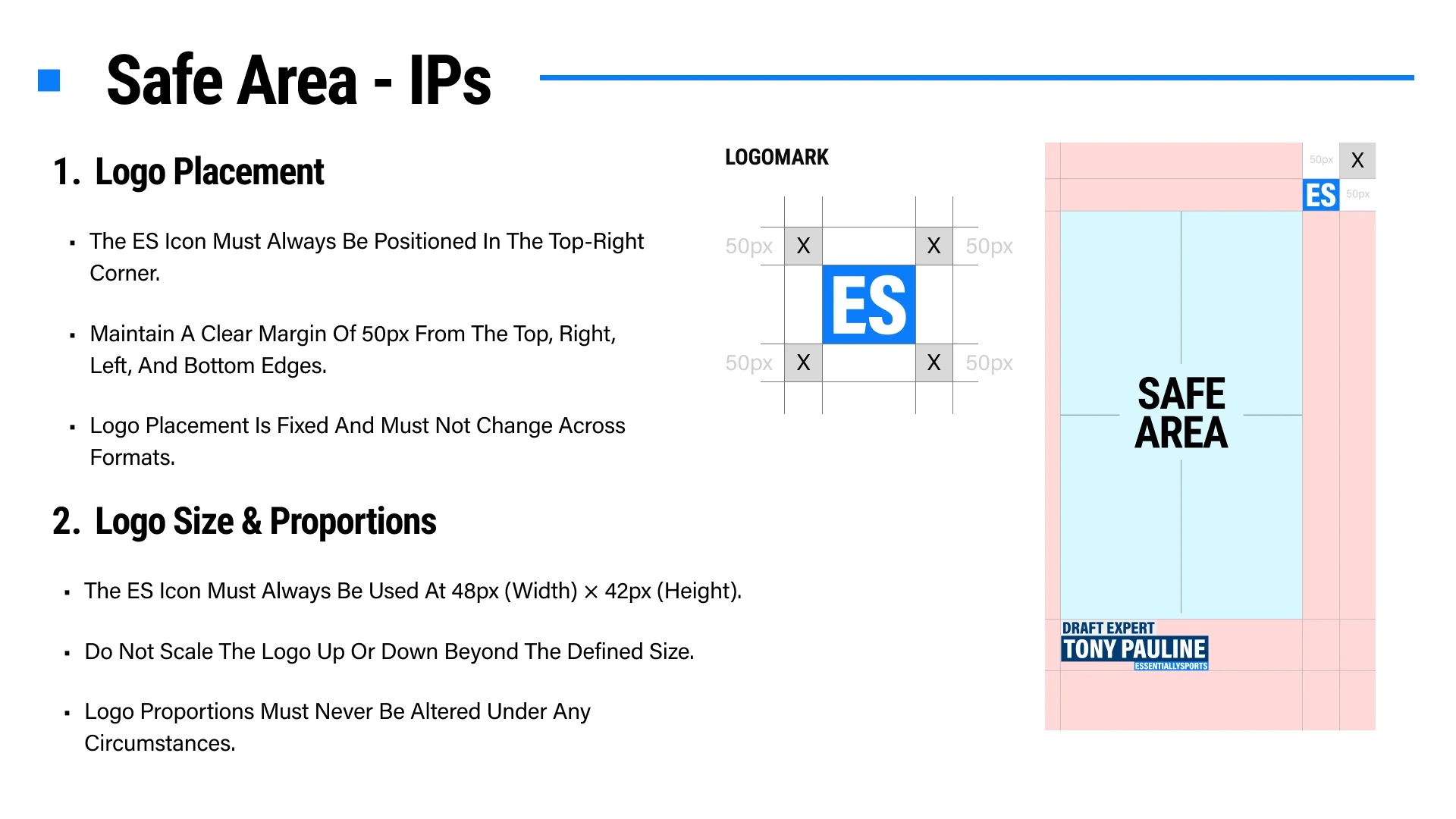
Position the ES icon in the top-right corner for approved video IP and short-form formats. Its location is fixed and should remain consistent across every post.
Use the icon at 48px wide by 42px high and maintain 50px clearance from the surrounding edges. Never scale or distort its proportions.
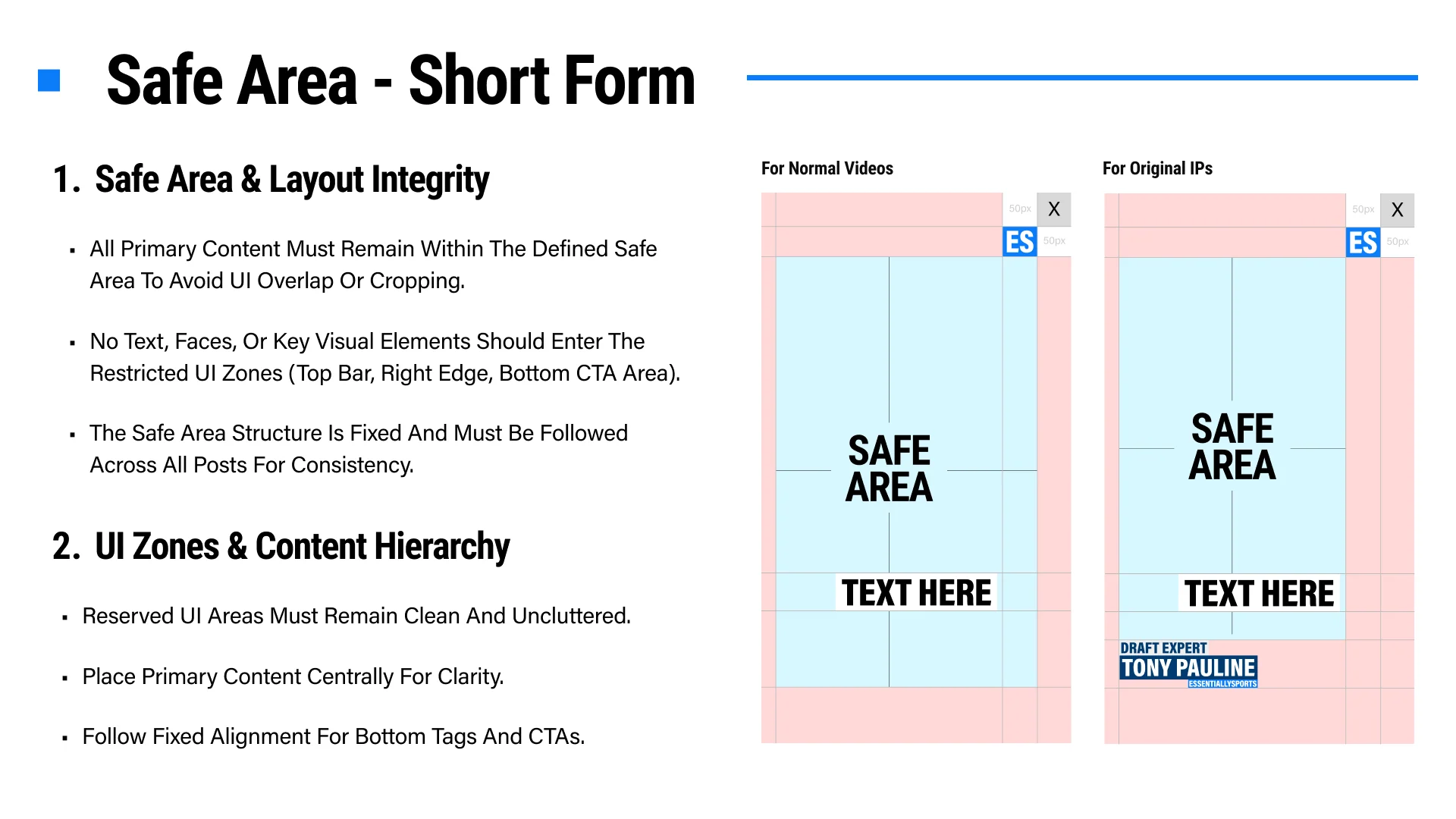
Keep faces, text, logos, calls to action, subtitles, and other key visuals within the defined safe area so platform controls cannot crop or obscure them.
Keep the top bar, right edge, and bottom CTA areas clean and uncluttered. Place primary content centrally and follow the approved bottom-tag alignment.
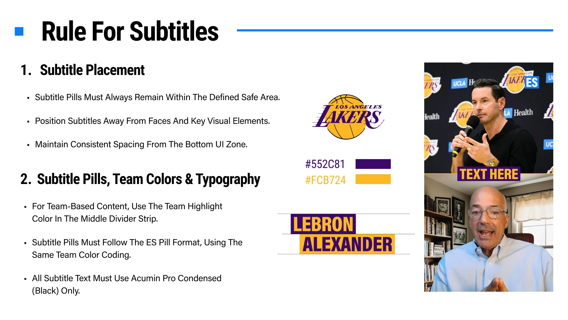
Subtitle pills must remain within the safe area, away from faces and important visual elements, with consistent spacing from the bottom interface zone.
Use the approved ES pill format with Acumin Pro Condensed Black. For team-based content, apply the team highlight colors to the divider and pill treatment while preserving strong contrast.
Instagram and YouTube workspace exports are JPEG files. Use the exported file directly unless a channel owner specifically asks for another format outside this tool.
For standard social creatives, the ES logo stays top-right unless a Swipe Button is present, in which case it moves to top-left. Quote Image mode can switch between Bottom Logo and Top Logo, but the logo must keep its approved size and proportions.
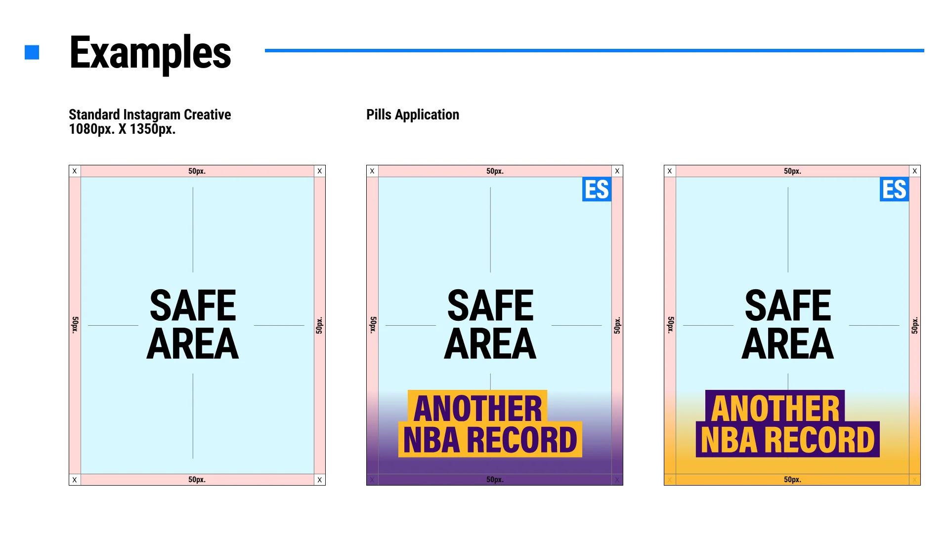
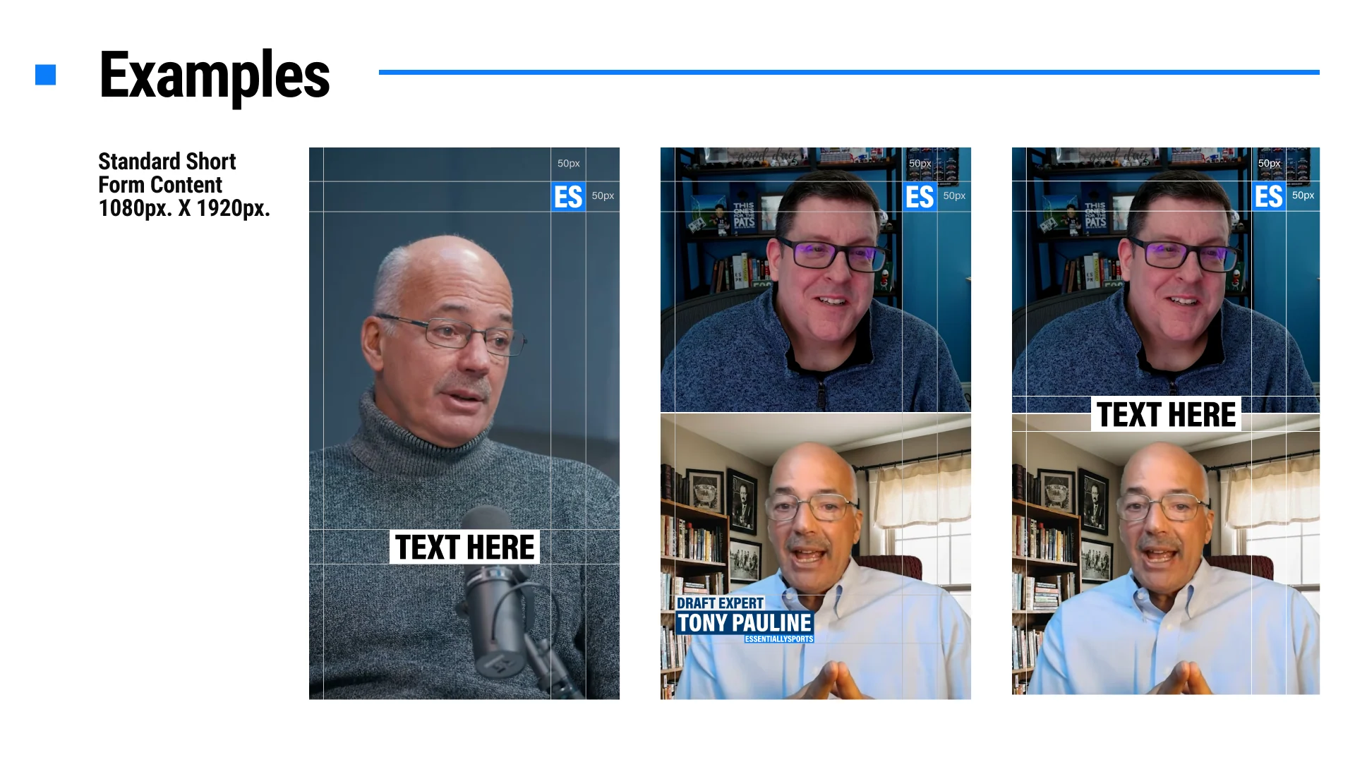
Maintain a 50px safe area from the edges on standard Instagram creatives. For short-form and video content, keep all text, faces, logos, CTAs, and key visuals inside the defined safe zones to avoid platform UI overlap or cropping.
Pills and quote strips must stay readable, high-contrast, and unclipped. Keep spacing consistent, leave enough room for tall letters, and use the position sliders for controlled offsets instead of forcing text into tight stacks.
Instagram feed creatives use 1080px x 1350px. YouTube thumbnails use 1280px x 720px. Short-form video guideline references use 1080px x 1920px, but this tool currently focuses on the social and YouTube workspaces.
Quote Image mode supports up to three quote lines, the approved quote icons, and either Bottom Logo or Top Logo placement. Move quote text directly from the rendered text area only, and keep the final layout inside the safe area.
The Swipe Button is optional and must sit in the bottom-right corner with a 50px margin from the right and bottom edges. Its size is fixed at 200px x 56px, and it should never cover the main text, logo, or subject.
Use approved ES typography only. Canvas headline and quote treatments use the approved condensed display style, while the UI keeps readable labels at 14px or larger. Subtitle pills should follow the ES pill format and approved condensed style.
Choose sharp, well-lit images with a clear focal subject. Keep faces and key details away from UI zones, avoid noisy crops, and frame subjects so they feel intentional rather than cramped or too distant.
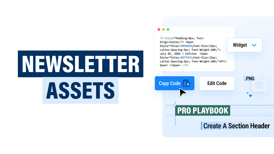
Include the requester name and email, request type, newsletter or sport, lead story, key entities, publishing time, copy direction, and any approved image references. Clear inputs reduce revision loops.